Bora Group
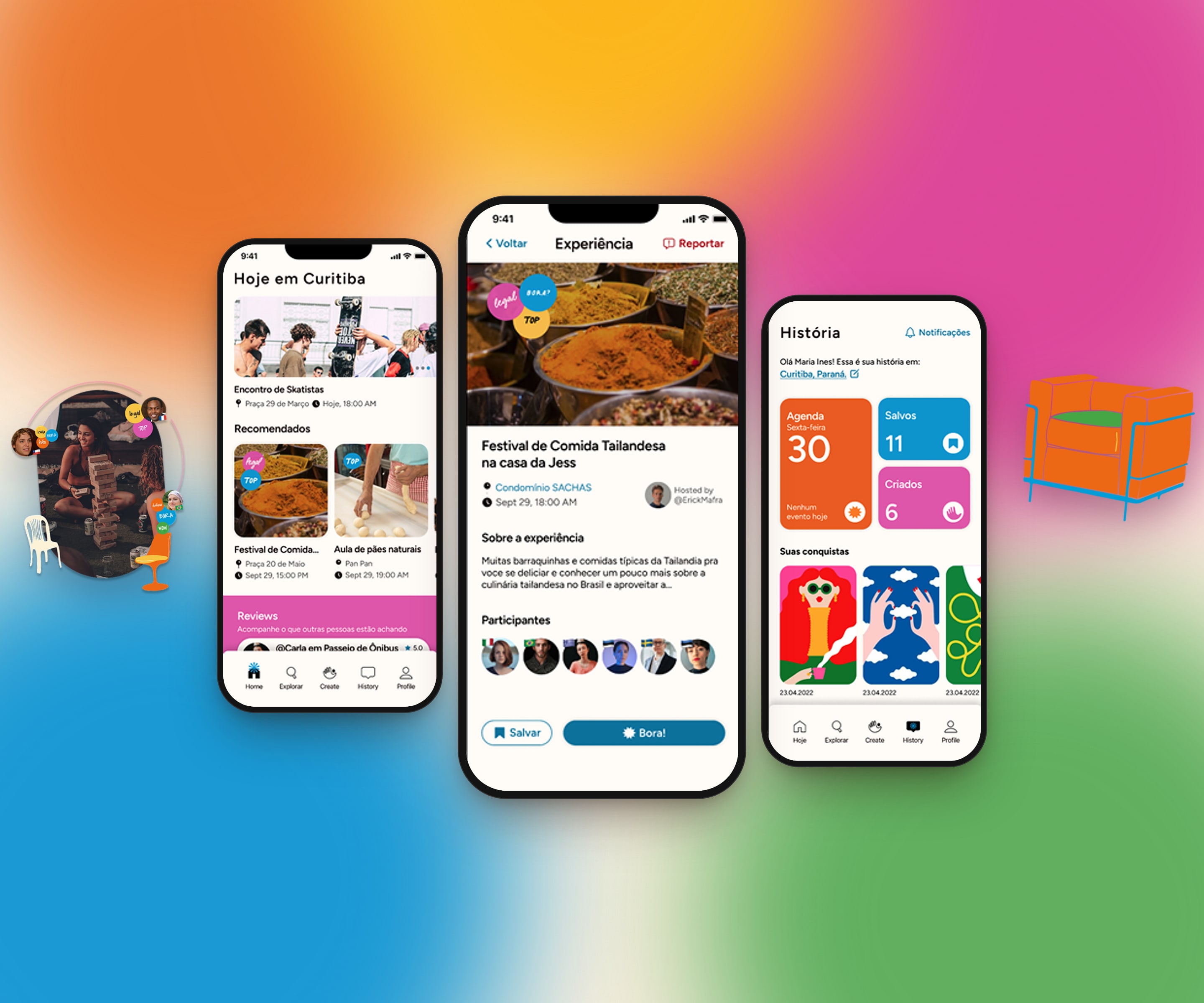
Created by seven women who love to travel and meet people, for the last app challenge of the Apple Developer Academy. The Bora.Today app and the BoraCast podcast aimed to ease the adaptation of immigrants and travelers in new countries and cities.
- Bora Group (Apple Developer Academy)
- Four months
- Product Designer, UI/UX, UX Research and SwiftUI developer
- Figma, Notion, Jira, Adobe and Google Workspace
- Barbra Eliza, Larissa Paschoalin, Sthefanny Gonzaga, Deborah Eberle, Bruna Martins and Ana Stege
Seven women, one app challenge.
The topic was entirely the team's own and aimed to reduce the loneliness and difficulty of interaction of people who move, through Bora.Today and BoraCast. Today neither project is live because of naming and trademark issues, but they were published for two months.
The challenge: create experiences and connections between people of different cultures and ease the negative feelings caused by migration.
Understanding what immigration and travel mean.
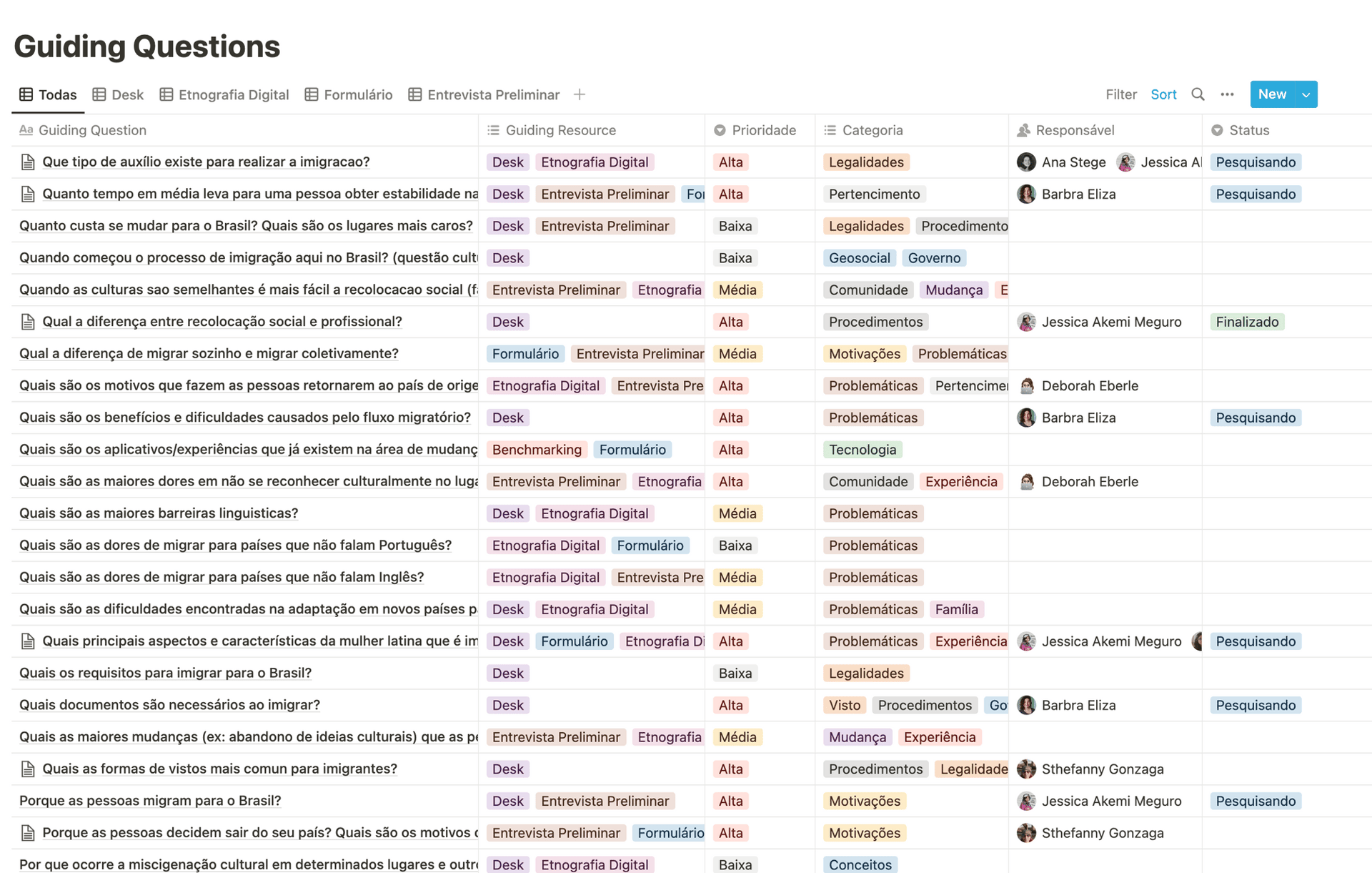
The first research was done by Barbra, Sthefanny and me, to understand the legal side: how government procedures work, the problems immigration can cause, and which technologies and experiences already existed. We always read findings together to keep the team aligned.
Then other team members ran a digital ethnography on networks such as Reddit and Facebook and on podcasts about immigration.
Preliminary interviews and survey.
“Moving is abandoning a safety net that holds you when you fall and having to go find connections to build another.” An interviewee's answer.
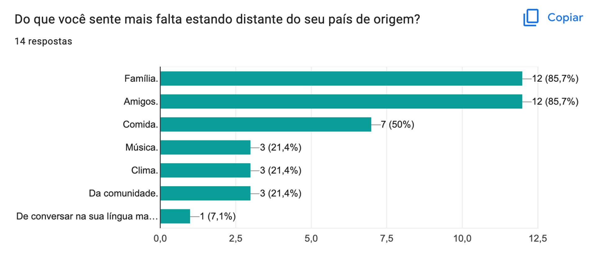
The interviews aimed to understand the pain of people who immigrated, are immigrating, or returned to their home country. The survey, which I organized and the team edited, showed what people understood by immigration and whether they had used travel or relocation apps.
Main insight: what travelers and immigrants missed most was a support network and emotional support. Finding official content was not the problem, and the phrase “culture shock” repeated across answers from different places.
Understanding the user journey in immigration.
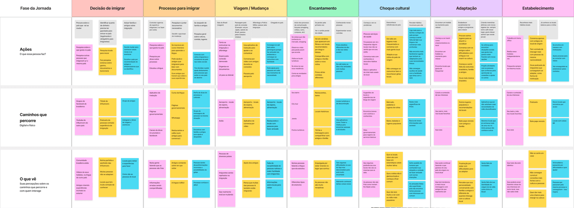
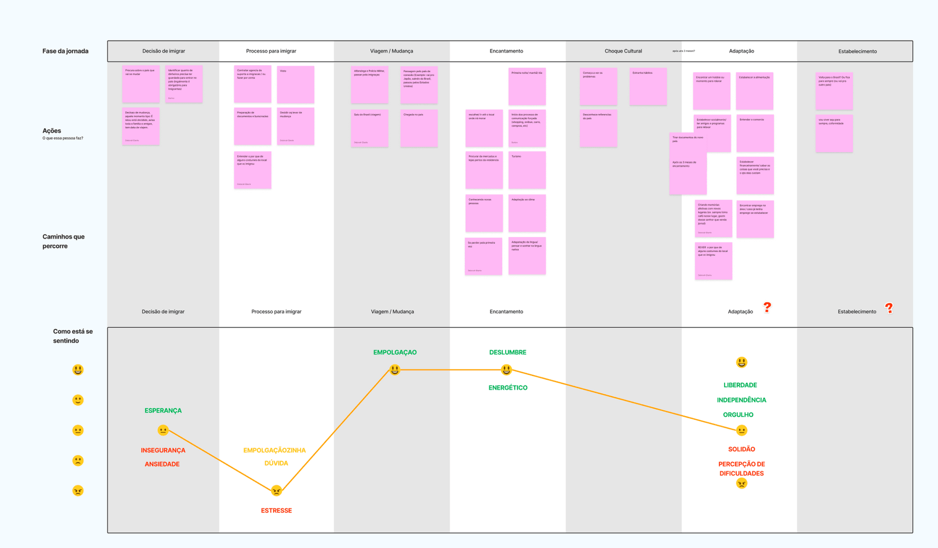
We ran an exercise to understand the path from immigration to being considered an expat, building a speculative trip from the team's collective repertoire. It showed the moments where there is pain or opportunity for a product that reduces loneliness, stress, insecurity and anxiety.
Brainstorming and benchmarking.
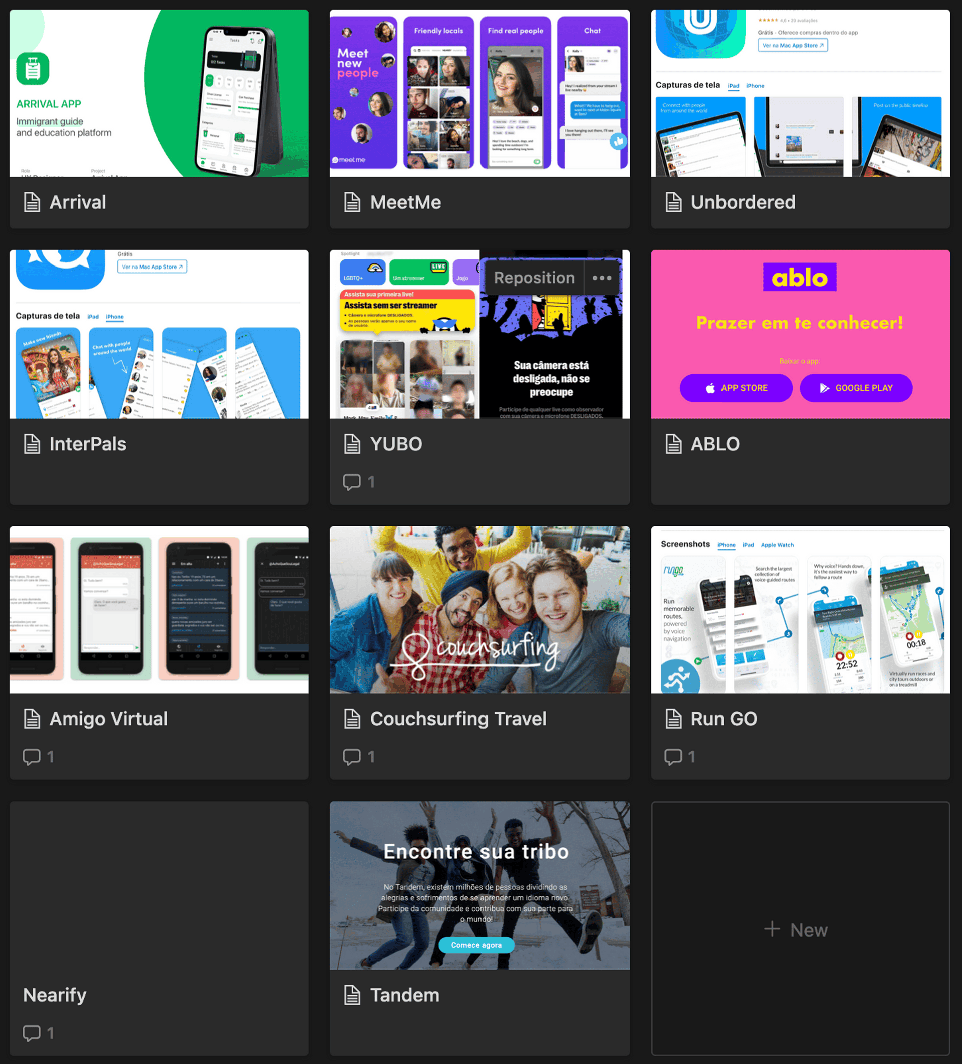
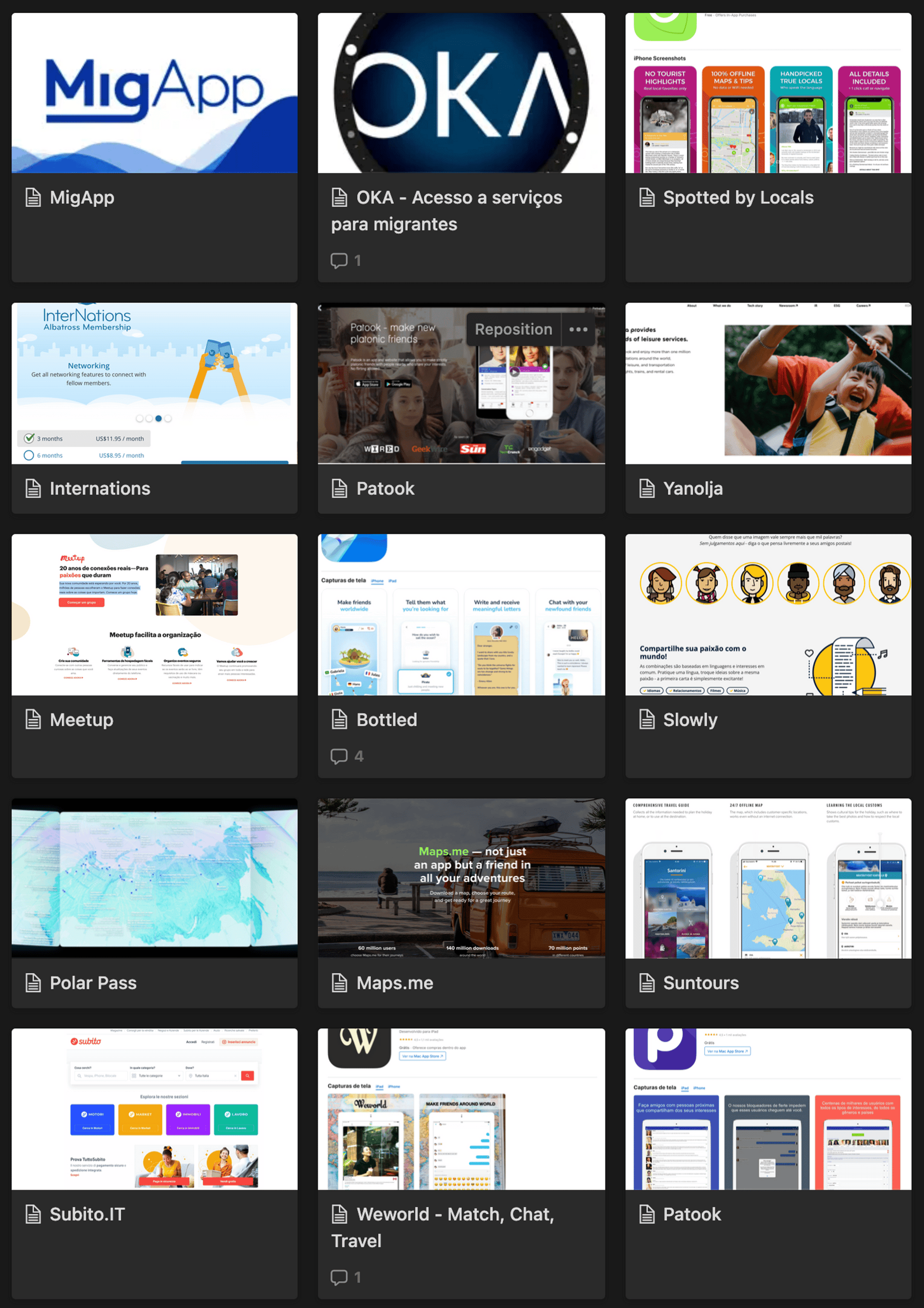
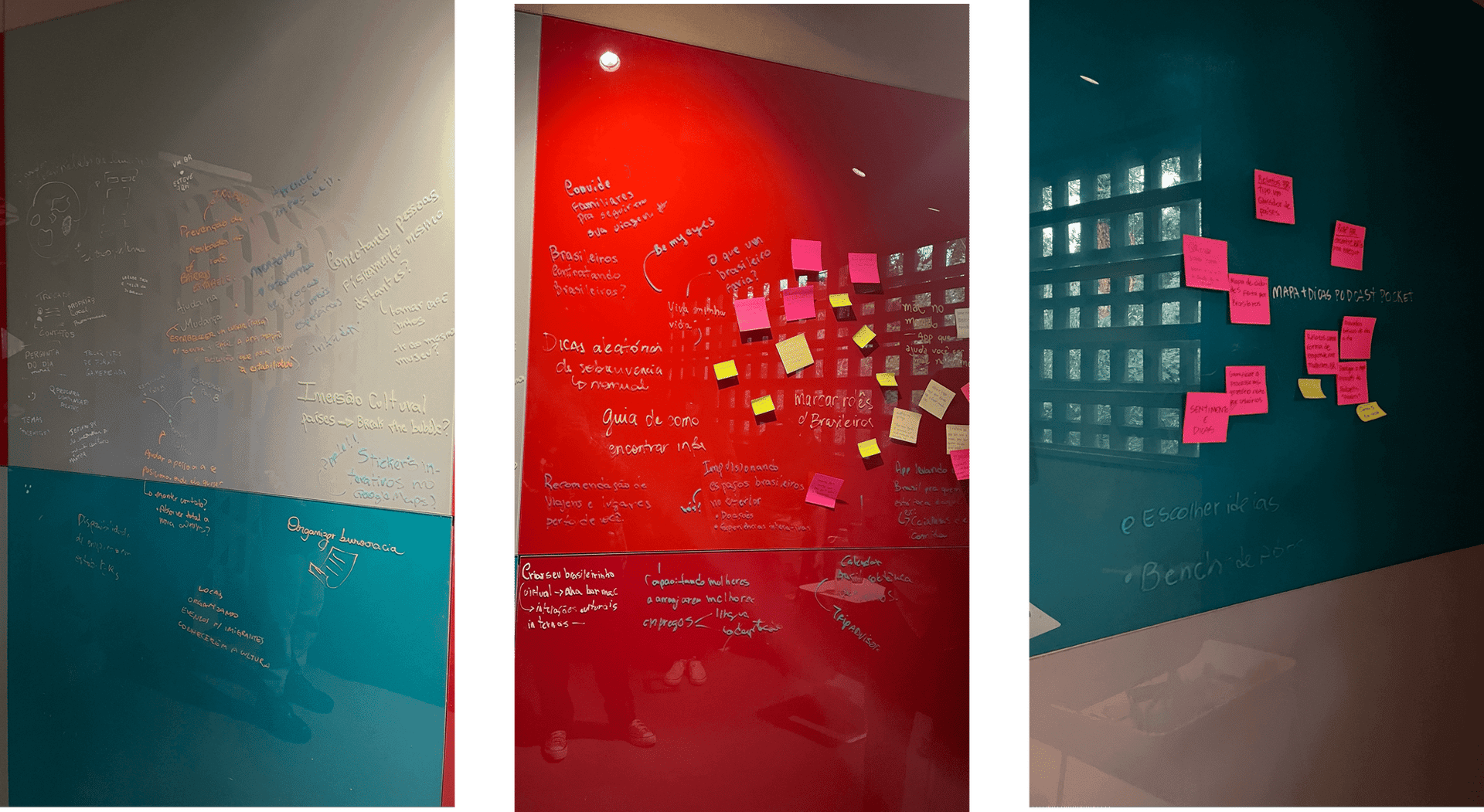
In the brainstorm, everyone brought what they saw as the core feature. The benchmark complemented the research with 41 items across different segments, looking for competitors and similar ideas.
Three possible solutions.
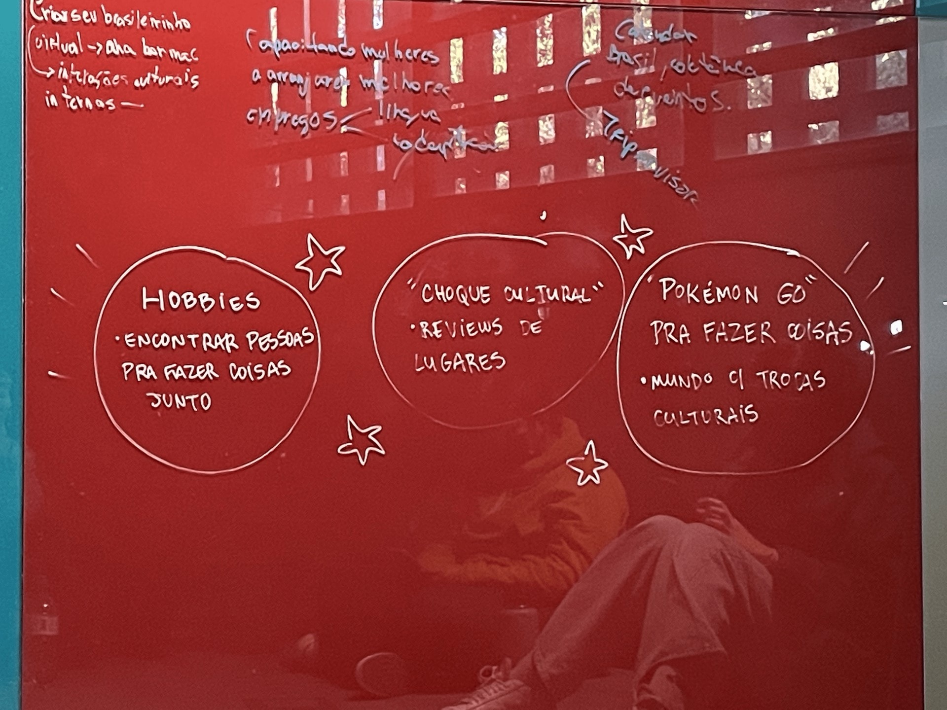
Everything reinforced the idea of not building a social network of direct interaction, but something people interact with, through maps, content or gamification. The three solutions explored in the following weeks were:
Hobbies: finding people to do or discover hobbies together. Culture Shock: a cultural “Glassdoor” of places, to interact and get information. Gamified Map: something like Pokémon Go, with exchanges in a virtual world that reflect real-world activities.
Always digging deeper.
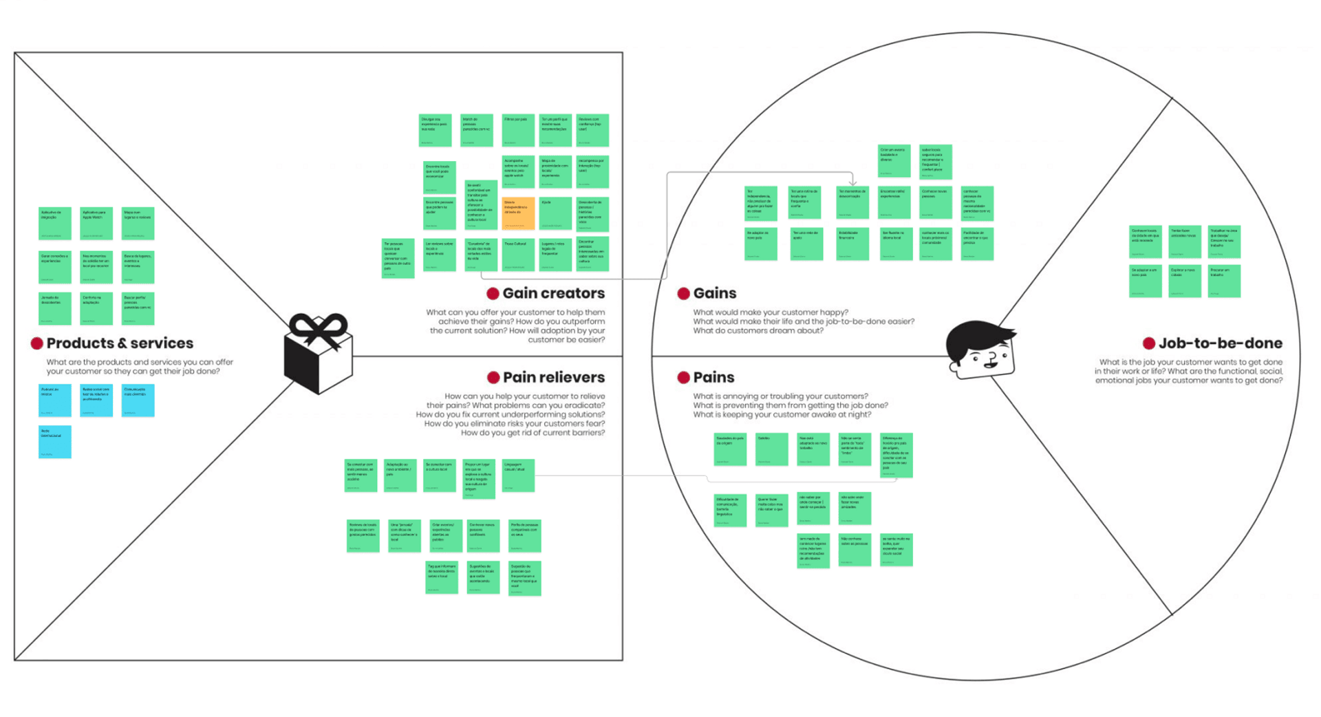
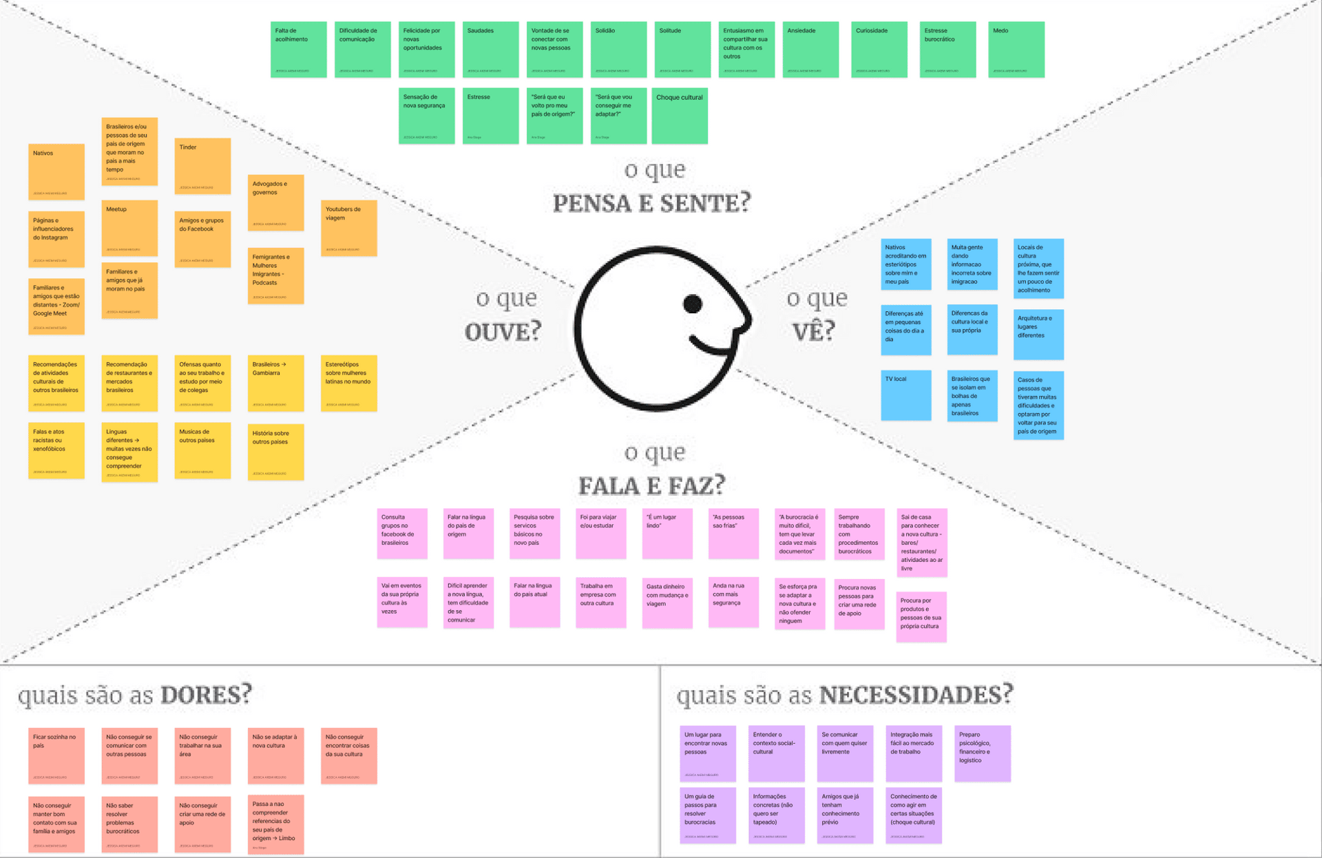
With ideas closer to a solution, we dug deeper into cultural experiences using frameworks such as Empathy Map, User Journeys and Value Proposition Canvas.
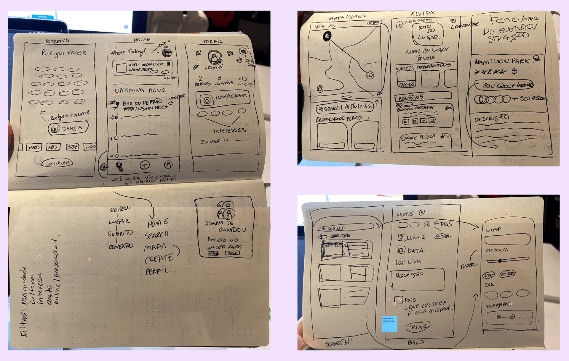
Always sketching on paper first.
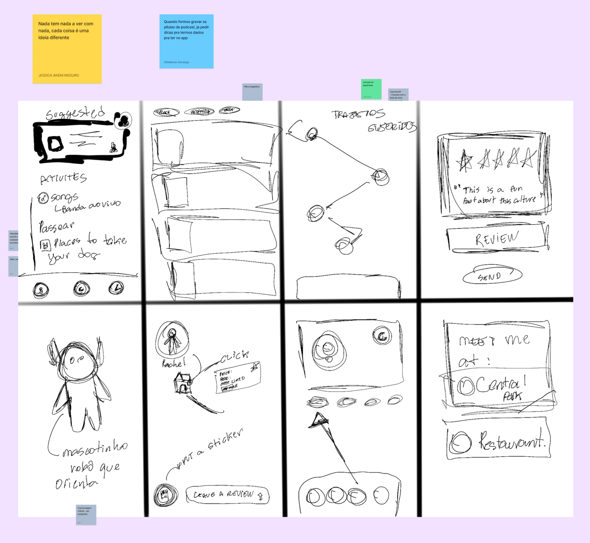
We used the Crazy 8 technique so we would not get stuck on perfection: each of us developed a full idea in drawings, and we discussed them together to pick the best solutions.
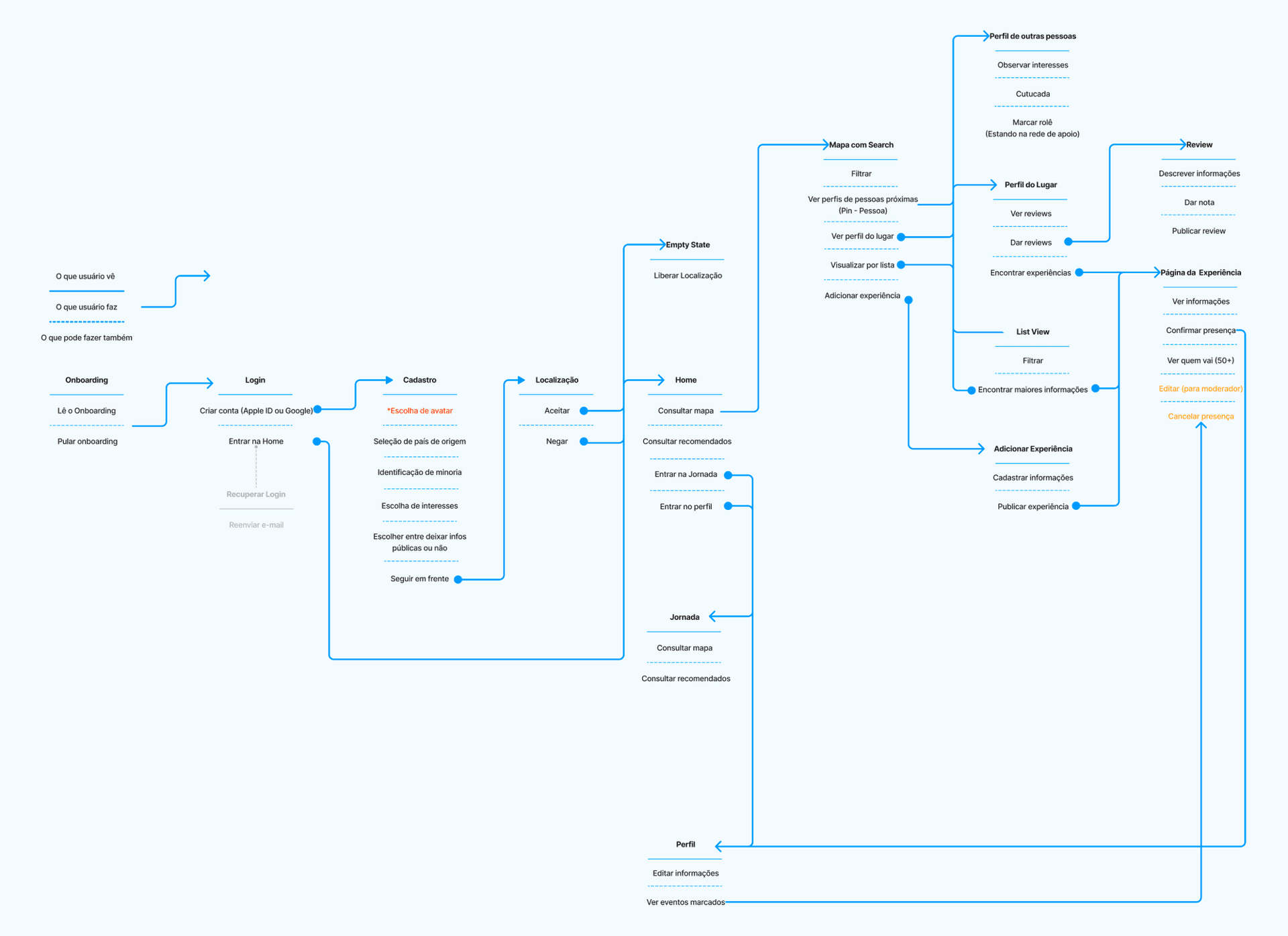
After the discussion, Larissa and I defined the app's usage flow, and we moved on to designing screen by screen in Figma, iteratively and collaboratively.
Turning an idea into reality.
We followed a calm path: low fidelity, paper and drawing, mid fidelity (revised many times) and finally high fidelity with a clickable prototype. Deborah and I built the screens. When creative difficulties came up, we started holding Critiques.
Once the final visual identity was set, we built the UI in the prototype and the Design System at the same time. Because of the deadline it was a risky decision, but cooperation and communication avoided big frustrations.

Process